Quick Foods — Frontend Feature Overview
Python
62 views
Case Details
🍔 Quick Foods — Frontend Feature Overview
A clean, responsive, and real‑time shopping experience for multi‑store food ordering. This document focuses only on the frontend: UI/UX, interactions, and user flows across Customer, Store Admin, and Admin views (no backend tech).
🧭 Global UX & Design Principles
- Responsive Layout: Mobile‑first grid with breakpoint‑aware components; cards reflow (1 → 2 → 4 per row), sticky header on scroll.
- Consistent Navigation: Top navbar (logo, search, cart, auth), contextual breadcrumbs, tabbed sub‑navigation in store pages.
- Keyboard & A11y: Focus states, aria‑labels on icons, ESC to close modals, Enter to submit forms, live regions for toast messages.
- Visual Feedback: Loading spinners, disabled states, skeleton loaders for lists/images, optimistic UI where safe.
- Theme Tokens: Primary/secondary colors, status badges (success/info/warn/danger), elevation (shadow‑sm/md/lg), rounded‑xl.
- i18n‑Ready Copy: Text keys grouped by domain (navbar, cart, checkout, orders, admin); date/number formatting consistent.
- Client‑Side Validation: Inline error hints, password strength meter (Low/Middle/High), zip code auto‑complete via TWzipcode.
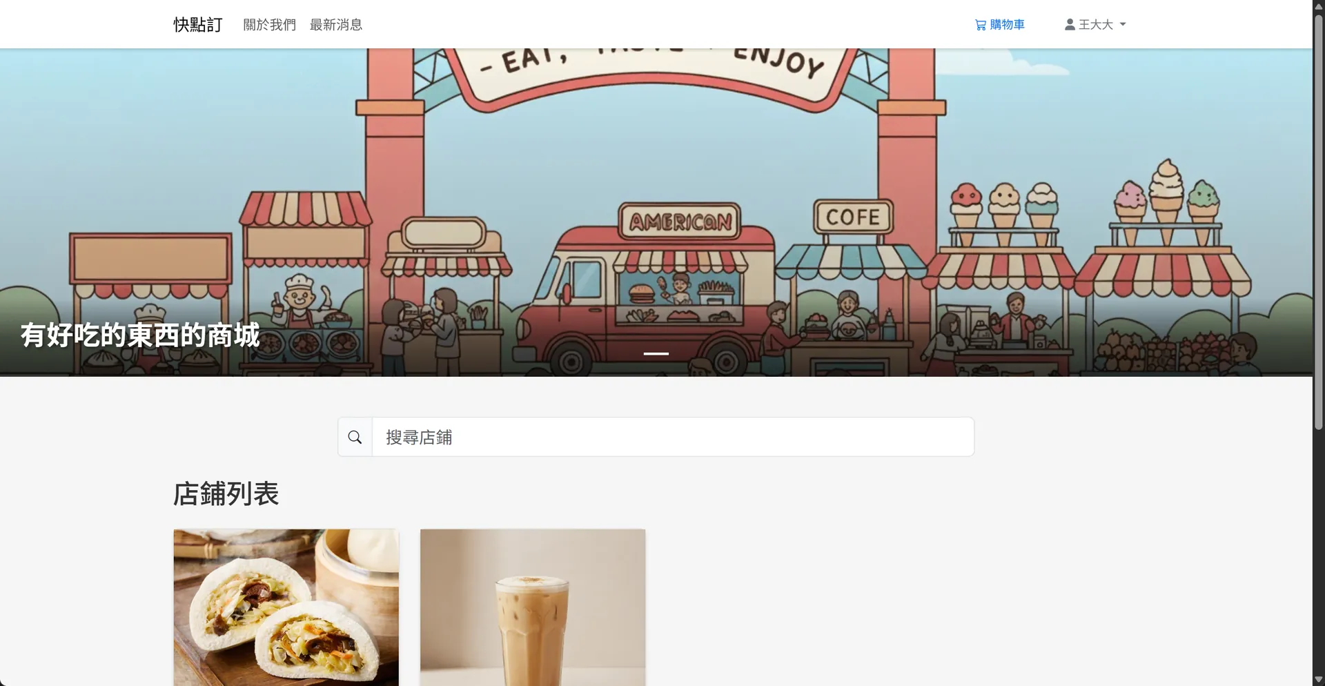
🏠 Customer Storefront
1) Home
- Hero Carousel: Clickable banners (title + subtitle + CTA). Auto‑rotate with pause‑on‑hover.
- Store Gallery: Card grid; each card shows store image (fixed height 200px), name, tags, rating (optional), and “View Store” button.
- News Highlights: Card deck with cover image, publish date chip, and read‑more link.
2) Store Page
- Store Header: Store banner, avatar/logo, name, short description, today’s open hours.
- Category Filter Bar: Pills with active state; supports horizontal scroll on mobile.
- Product Grid: Uniform cards with image, name, price (discount strike‑through if any), stock badge, and “View Details” button.
- Sort & Search: Dropdown (Newest, Price ↑/↓, Popular) + in‑store search box (debounced).
3) Product Detail (Modal)
- Media Carousel: Swipeable on mobile; pinch‑to‑zoom on images.
- Core Info: Name, long description, price with discount logic, stock indicator.
- Toppings Selector: Checkbox list with price chips; displays selected count / max; disables remaining when limit reached.
- Drink Option: Radio group — 🧊 Cold (+$) / ☕ Hot (+$) / None (default). Auto‑recalculate total.
- Quantity Stepper: Min/max enforced by stock; total updates in real time.
- CTA Buttons: “Add to Cart”, “Checkout Now”. Sticky bottom action bar on mobile.
- Micro‑copy: Tooltips for pricing rules; inline alerts for constraints (e.g., topping limit reached).
4) Cart Drawer / Page
- Line Items: Name, unit price, selected toppings (chips), drink selection, quantity stepper, per‑item subtotal.
- Update in Place: Changing qty/toppings/drink recalculates totals instantly.
- Prominent Totals: Subtotal, delivery (if any), order total; sticky summary panel on desktop.
- Empty State: Illustration + “Explore Stores” CTA.
5) Checkout
- Address Form (TWzipcode): County → District → Zip auto‑fill; address line; phone input mask.
- Recipient Profile: Auto‑remember previous entries; inline edit.
- Payment Method: COD radio tile; extensible tile layout for future methods.
- Order Review: Read‑only cart snapshot with per‑store grouping when multi‑store.
- Place Order Button: One‑tap on mobile; loading state + success screen with order numbers.
6) Account
- Profile: Name, email, password strength meter; avatar upload with preview & crop.
- Addresses: Editable list, set default; validation with live hints.
- Orders: Paginated list with status chips (Pending / Processing / Completed / Cancelled), filter by time/status.
7) Order Details
- Header: Order number, status badge, placed time.
- Shipping Info: Recipient, phone, full address, delivery notes.
- Items: Product, toppings chips, drink icon (🧊/☕), qty, unit price, line total.
- Totals: Summary pane + print/download receipt.
- Live Updates: Status changes reflected without page refresh.
🏪 Store Admin (Shop Console)
Frontend pages here are scoped to a single store owner’s view.
1) Dashboard
- KPI Cards: Today’s orders, revenue, pending count; quick actions (Create Product, View Orders).
- Live Feed: Real‑time banner for new orders (sound + toast + bell red dot).
2) Product Management
- Product List: Table with thumbnail, name, price, stock, active toggle, quick edit.
- Create/Edit Product: Multi‑step modal (Basic → Pricing → Inventory → Images → Options).
- Toppings Config: Toggle availability; per‑product price overrides with small input chips.
- Drink Options: Checkboxes for cold/hot + extra price fields; preview of customer‑facing choices.
- Image Manager: Drag‑and‑drop upload, cover selection, reorder via drag.
3) Toppings
- Toppings List: Name, default price, enable/disable; search and pagination.
- Limits: Store‑level max toppings per item; inline help explaining effects on product modals.
4) Orders
- Order Queue: Kanban (Pending → Processing → Completed/Cancelled). Drag to update status.
- Order Card: Order number, time, items summary, amount; expand to details.
- Bulk Actions: Mark selected as Processing/Completed; print tickets.
- Sound/Toast Controls: Mute toggle, persistent bell counter until viewed.
5) Store Settings
- Profile: Store name, logo, banner, description.
- Display: Opening hours, contact info, pickup/delivery notes.
- Constraints: Max toppings per item, default drink options visibility.
🔧 Admin (Content & Catalog Presentation)
Focused on frontend management screens visible to administrators; content is reflected in the storefront.
1) Homepage Banners
- List & Sort: Drag‑and‑drop order; enable/disable toggle.
- Create/Edit: Title, subtitle, link URL, image upload (suggested 1920×480), live preview.
2) About & News
- Markdown Editor: Rich text with toolbar; preview pane using the same rendering as storefront.
- News Cards: Cover image, publish date, title, excerpt; grid layout with responsive columns.
3) Store Catalog Oversight
- Stores Table: Thumbnail, name, status; quick actions to view as customer.
- Badges: Indicators for incomplete profiles (e.g., missing banner/logo) to improve presentation quality.
🔔 Real‑Time UX
- New Order Alerts (Store Admin): Toast + bell red dot + optional sound. Clicking opens the order drawer.
- Live Status (Customer): Order status chips update in place on the order list/detail pages.
- Inventory/Price Sync: Product cards reflect changes without full reload; disabled states when out of stock.
📱 Responsive Patterns
- Nav Collapse to hamburger on <992px; cart becomes a floating button with item count.
- Sticky CTA Bars in modals and checkout (mobile).
- Grid Adaptation: Product cards: 1‑col (≤480px), 2‑col (≤768px), 4‑col (≥1024px).
- Touch Gestures: Swipeable carousels, pull‑to‑refresh (optional), long‑press image preview.
♿ Accessibility & Usability
- Color Contrast meets WCAG AA; non‑color indicators for state (icons + text).
- Semantic HTML landmarks: header/nav/main/aside/footer.
- Form Hints:
aria‑describedbyfor inputs; inline errors with clear actionables. - Focus Management: Trap focus in modals; restore focus to trigger on close.
- Reduced Motion: Respects user
prefers‑reduced‑motionfor transitions.
🔍 Search, Filter, and Sort
- Global Search in navbar (stores & products); debounced with loading indicator.
- In‑Store Filters: Category pills, price sort, availability toggle.
- Empty & No‑Result States: Friendly illustrations and suggested actions.
🖼️ Media & Assets
- Image Handling: Lazy‑loading, intrinsic ratio containers, error fallbacks.
- Placeholders: Skeleton loaders for cards and product modals.
- Icons: Consistent iconography for status (🧊/☕, cart, bell, check, x, clock).
🔐 Frontend Validation & Feedback
- Password Strength Meter: Low/Middle/High with live tips.
- Address Completeness: County/District/Zip checks; phone format hints.
- Form States: Disabled submit until valid; success toasts; inline error annotations.
📄 Printable & Shareable Views
- Order Receipt: Print‑friendly stylesheet; QR for quick reorder (optional).
- Share Links: Copy link buttons for products and stores; social preview meta (title/desc/cover).
🧪 Frontend QA Checklist (Excerpt)
- [ ] Navbar: auth/cart/search states across breakpoints
- [ ] Product modal: topping limit enforcement & price math
- [ ] Drink option radios: default to “None”, total recalculates
- [ ] Cart: edit line items updates totals without flicker
- [ ] Checkout: TWzipcode cascades correctly, forms validate
- [ ] Orders: live status updates; badges reflect transitions
- [ ] A11y: focus order, aria labels, ESC to close, tab trap
- [ ] Performance: images lazy‑load, skeleton before content
📌 Copy Blocks (i18n‑Ready Examples)
- Navbar: Home · Stores · News · About · Login · Sign Up · Cart ({count})
- Buttons: Add to Cart · Checkout Now · Save · Cancel · Apply Filters
- Status Chips: Pending · Processing · Completed · Cancelled · In Stock · Out of Stock
- Toasts: “Added to cart” · “Order updated” · “Saved successfully” · “Validation required”
🧩 Component Inventory (Key)
- Navbar · Footer · Breadcrumbs · Tabs · Pills · Cards · Badges · Chips · Toasts · Modals · Drawers · Steppers · Carousels · Pagination · Tables · Empty‑state blocks · Skeletons · Tooltips · Form groups · Input masks · File/image uploader
✅ Summary
Quick Foods’ frontend centers on clarity, speed, and real‑time feedback. Customers get a delightful shopping flow (discover → customize → checkout), store owners get a live command center for orders/products, and admins curate a polished storefront via content tools — all responsive, accessible, and production‑ready on the UI side.
Project Information
- Python
- Published: 2025-11-10
- 62 views
- Visit Website